Context:
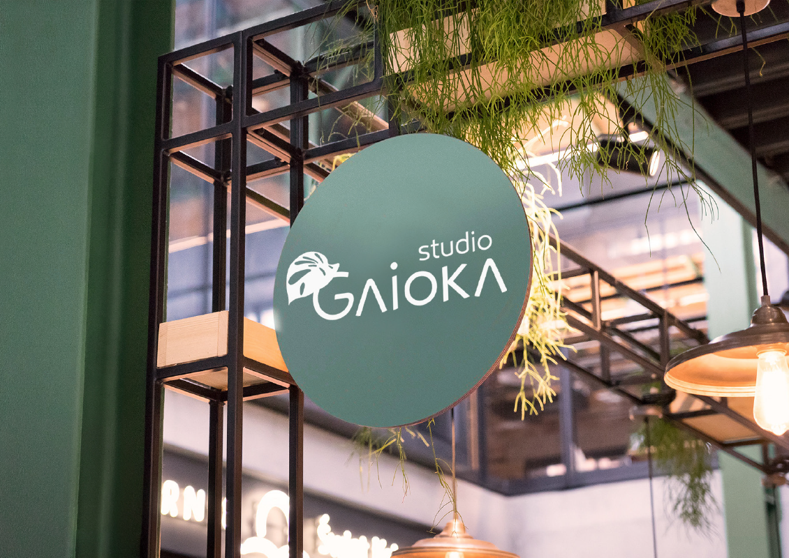
Gaioka is the studio of landscape architect Nicolle Maia, Master in Sustainable Architecture. The studio’s mission is to inspire change by planting the seed of sustainability through human-centered, nature-integrated projects that enhance well-being and environmental quality. The name “Gaioka” merges “GAIA” (Mother Earth) and “OKA” (house), reflecting the studio’s ethos of harmonious living with nature.
Gaioka is the studio of landscape architect Nicolle Maia, Master in Sustainable Architecture. The studio’s mission is to inspire change by planting the seed of sustainability through human-centered, nature-integrated projects that enhance well-being and environmental quality. The name “Gaioka” merges “GAIA” (Mother Earth) and “OKA” (house), reflecting the studio’s ethos of harmonious living with nature.
Challenge:
Redesign the Gaioka brand to achieve a more modern and iconic look while preserving its original essence and values.
Redesign the Gaioka brand to achieve a more modern and iconic look while preserving its original essence and values.
Graphic Solution:
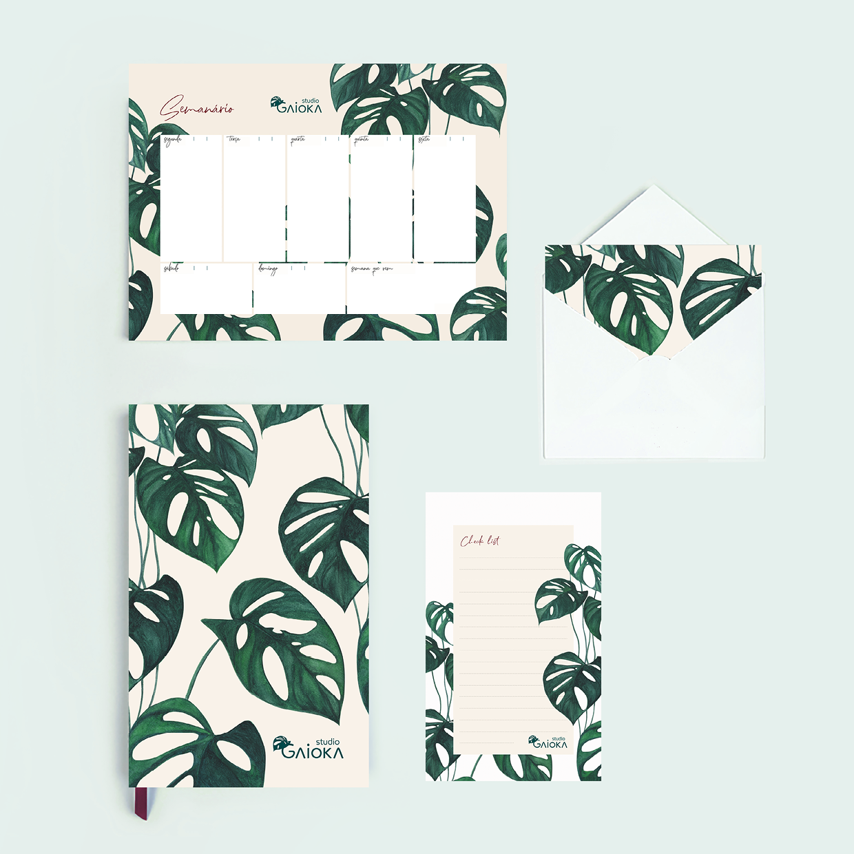
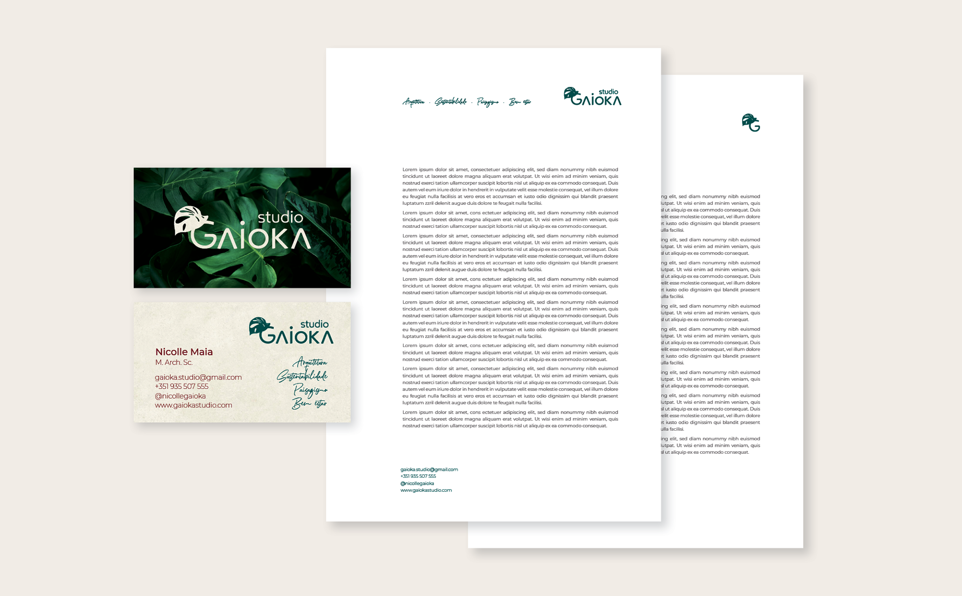
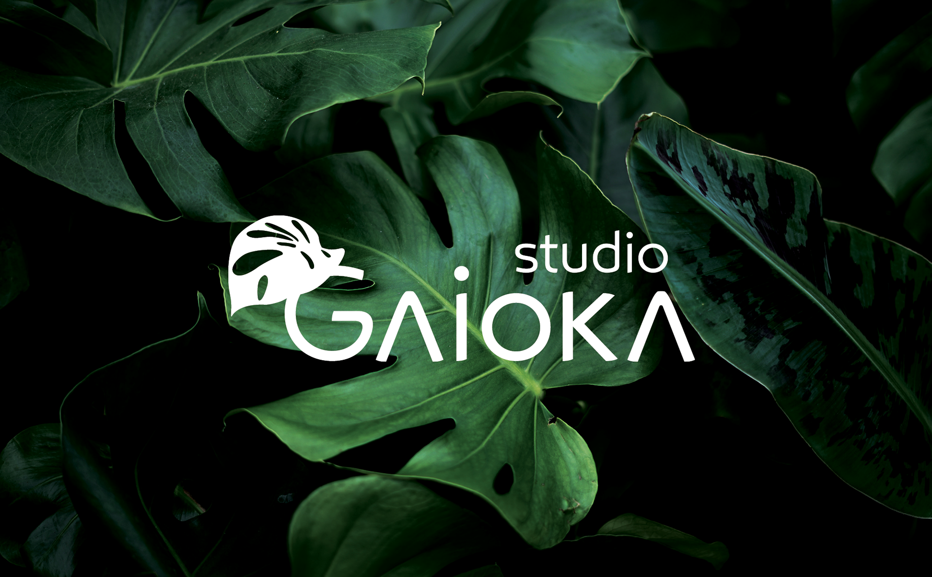
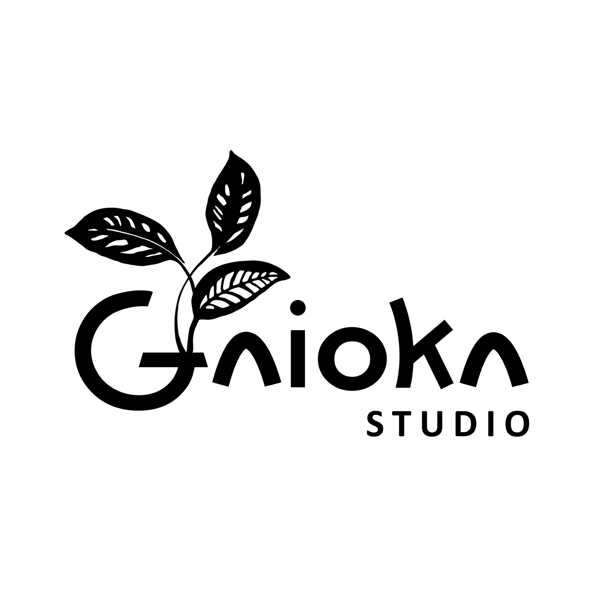
The Monstera Adansonii leaf, chosen for its charm and friendly appearance, remains the central symbol of the brand.
The leaf was redesigned to create a more iconic and memorable visual identity.
The font was updated to a contemporary style, enhancing the brand’s modern appeal.
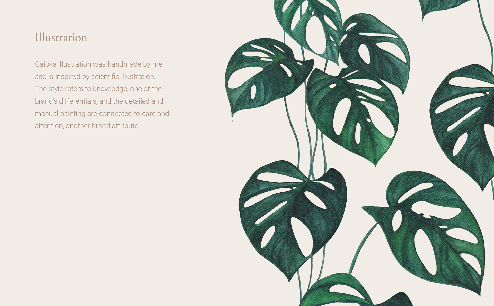
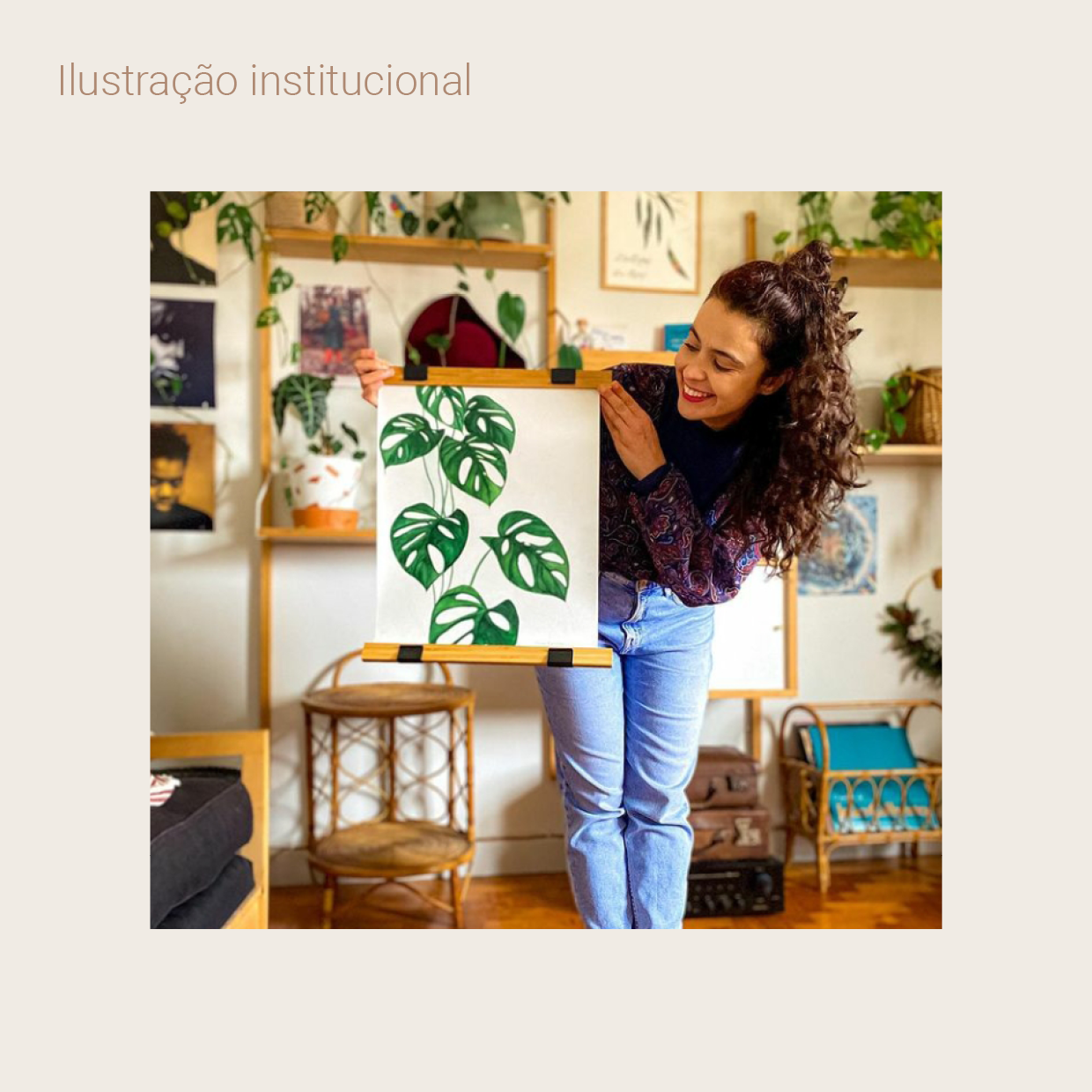
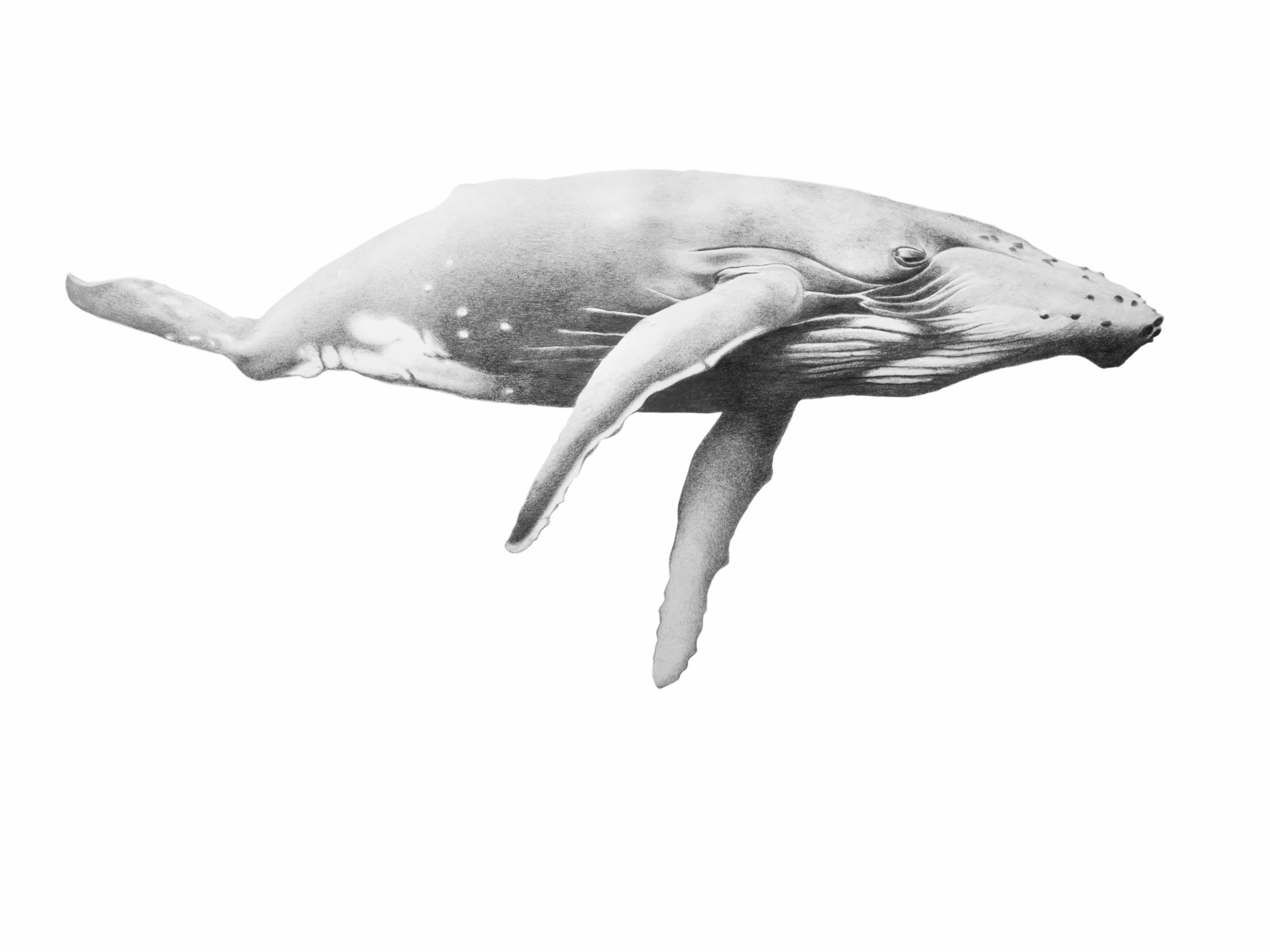
A custom watercolor illustration was created, referencing scientific illustration and highlighting Nicolle’s expertise in sustainable architecture.
My Role:
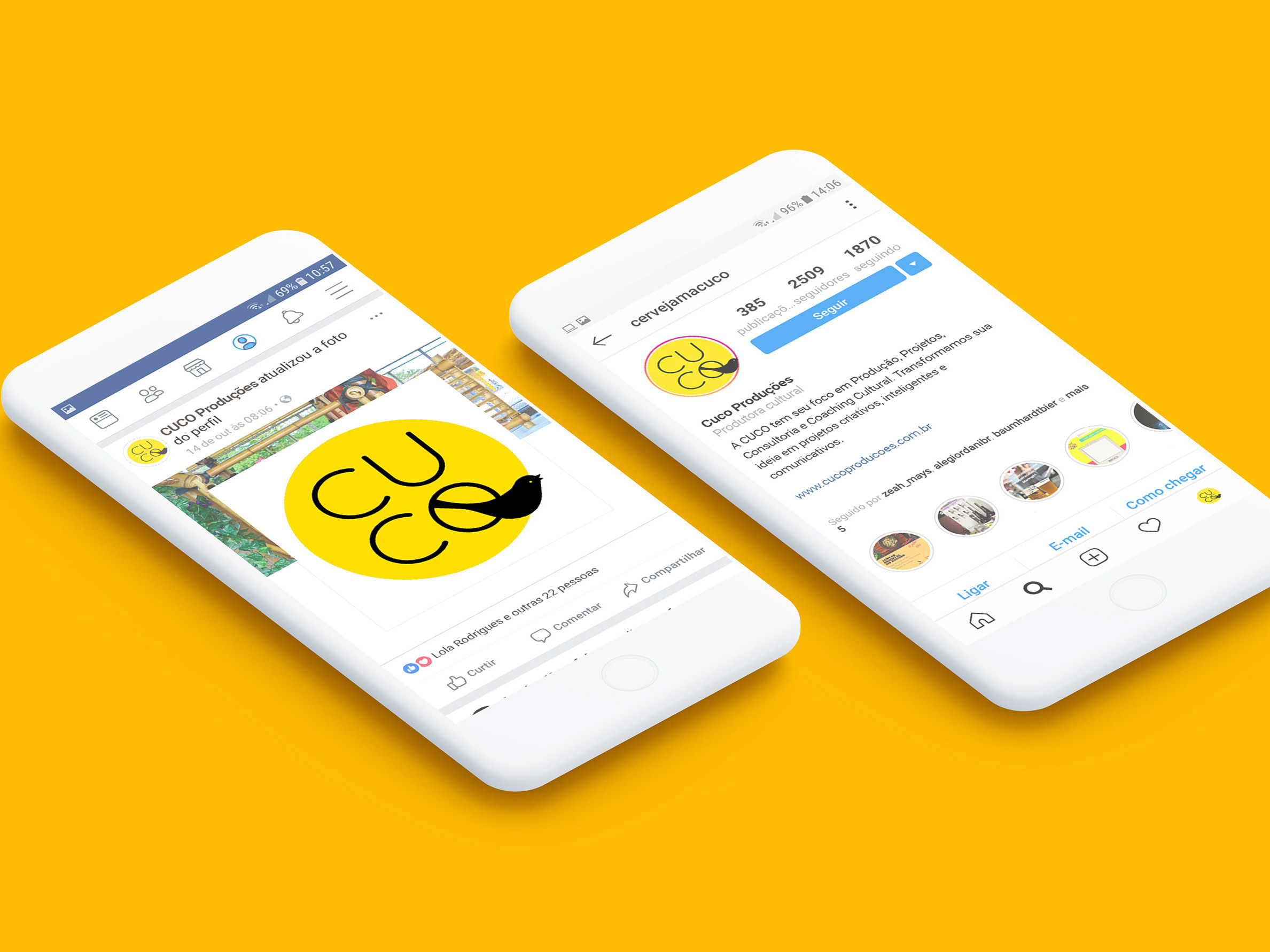
Brand Identity Designer responsible for the entire redesign process, from concept to execution. This included refining the brand’s visual language and ensuring it authentically represents Gaioka’s commitment to sustainability and well-being.
Brand Identity Designer responsible for the entire redesign process, from concept to execution. This included refining the brand’s visual language and ensuring it authentically represents Gaioka’s commitment to sustainability and well-being.
Logo antigo:
Logo atualizado: